Senior UX Designer, Customer Engagement
Hyderabad, Telangana, India

Case study
I'm still writing up the Jobi case study. If you have the key, pop it in for an early look.
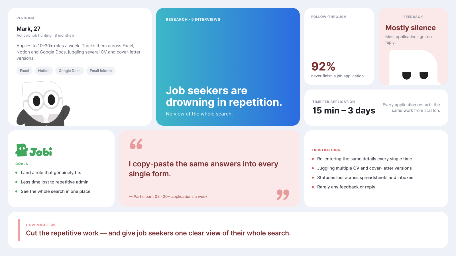
Back to homeJob hunt tools optimise for volume, more applications, more tracking, more streaks, and the evidence says volume is both emotionally corrosive and strategically worse. I designed and built a companion engineered around the user's emotional state instead of engagement metrics, while leading two UX designers and keeping every decision survivable in code.
Context
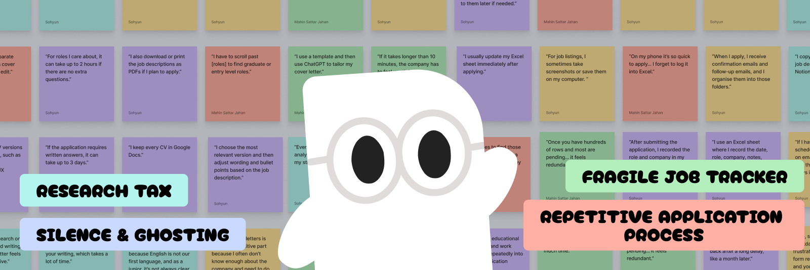
The modern job hunt is an emotional endurance test, and most tooling makes it worse. The research is consistent:
say the search hurts their mental health
experience anxiety during the search
feel burned out by the process
Hope, effort, silence, disappointment, repeated dozens of times. I was job-hunting myself while building Jobi, designing for a problem I was living daily.
Leading tools help you do more of the grind, faster. Jobi takes the opposite position: it is not a job board and does not automate applying. You find the jobs; Jobi helps with the judgement, the tailoring, the practice, and the memory of the journey.
Research
We interviewed five active job seekers and audited the two leading volume tools, Teal and Simplify Copilot. We clustered every quote into an affinity map; four themes kept surfacing, all sitting on top of the same emotional fatigue.
That question shaped every surface and decision that follows.
Design Process
The three of us ran the research, ideation and design together in Figma. From there I took each screen into Claude Code and built it into real, working software. The part that made it move was how I worked with Claude: I gave it everything, the interviews, the affinity map, every design decision and the reasoning behind it, so it carried the same context I did. That made it more than a co-developer. It became a design strategist I could think out loud with, weighing a design against build complexity, API cost and the business case before any of it shipped.
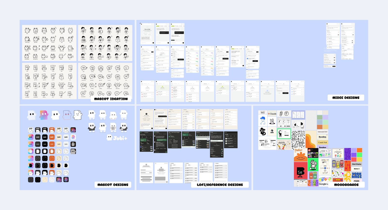
The Figma side of the loop: mascot directions, mid-fi flows, lo-fi wireframes and the moodboards behind the visual language.
Solution
Jobi rides along the whole hunt as a browser side-panel, judgement, tailoring, practice, and planning, each as its own surface.
The home surface is a conversation. Paste a role and Jobi tells you whether it's worth your time, tailors your documents, and researches the company, without leaving the page you're on.
A voice-driven mock interview that role-plays the real thing, questions, follow-ups, and feedback in the moment, so the first time you say the answer out loud isn't in the actual room.
Voice roleplay is the showcase of the interview, but speech recognition can be unsupported, the mic denied, or text-to-speech can fail, any of which would dead-end the lesson.
Voice and typed paths run in parallel throughout. A 'type instead' option is always offered, a blocked mic falls back to a text field, and even a speech failure degrades to simply showing the line and continuing.
Two near-identical speech subsystems to build and maintain, accepted so the experience never traps a user.
Every application in one pipeline, designed so a growing pile of rejections never becomes a wall of anxiety.
A job hunt accumulates rejections. The standard tracker gives every status equal weight in saturated traffic-light colours, turning the board into a wall of anxiety as closed applications pile up.
Statuses split into Active (front and centre) and Closed (de-emphasised, collapsible), so rejection is a real but tucked-away stage. Colour survives only in a small status dot and the summary funnel.
Closed applications are slightly harder to review, and there's less at-a-glance colour coding; the design leans on labels instead.
Emotional Design
Emotional design usually chases engagement. Jobi works in a domain people dread, where two-thirds of Gen Z job seekers report burnout. So the mascot, the motion and the voice all point the other way. They lower the cost of a brutal task instead of pulling someone back for a streak. It is aimed at the nervous system, not the dopamine loop.
The mascot has no mouth, in any pose. It works through its eyes and the set of its body instead: glasses on when it is analysing a role, a gentle bob while you wait, confetti when you land something. That is deliberate. Jobi already watches your hunt to help, so a full talking face would tip “companion” into “something is watching me,” the one feeling it has to avoid. The mismatch is the charm: a soft, near-cuddly creature delivering a dry, level line reads as deadpan, not harsh. It is also why the cursor-tracking eyes were built, tested and cut. Alive became watchful.
The personality is not decoration. It is a written system the team and the AI both build from, so every surface sounds like one being. Jobi is an accountability partner, not a cheerleader. It expects you to show up, and it teaches you to stop needing it. Five qualities stay fixed in every line, steady, honest, loyal, invested, particular. What moves is the tone, which dials down as the moment gets heavier.
“Still nothing?! Don't give up, you've got this!”
“No reply yet. That's normal three days in. Want to line up the next two while we wait?”
Rejection is the moment the companion is won or lost. There the rules tighten. No exclamation points, no clichés, the dry wit goes quiet. Move the blame off the user, then point forward. Get that one moment wrong and the whole idea falls apart.
Measuring success
The whole bet is that Jobi lowers the emotional cost of the hunt, so the usual product metrics, time in app and applications sent, are the wrong ones to chase. Those are what the volume tools optimise for. The first real test is our closed beta, and three things will tell us whether the bet is paying off.
What's next
Jobi is an ongoing project. The next milestone is a closed beta test session in July, putting the companion in front of real job-seekers to pressure-test the calls in this study, with an aim to release in August.
One feature still in design is the career plan: a coaching plan sized to the time you actually have, not a volume quota that burns you out. The hard part is holding the line, capping eager users at a few quality applications a day instead of the bigger number the product knows is harmful. So it is being built slowly, on purpose.